

Frasers Property Australia | Digital Agency Switch
Client:
Property development
Sector:
Visit sites:
My role:
- User Research, Competitor Research
- Preparing and facilitating workshops with client’s stakeholders
- Information Architecture, Use Case and Customer Journey Mapping
- UX/UI Design of all components and templates
- Design System creation
- Quality Control
Time:
October 2022 - May 2023
Quick facts about my contribution to the project
10 hi-fi wireframes
developed to define and visualise the layout and structure of key webpages
3 creative concepts
designed to explore different visual directions for new residential sites
80 components
designed and re-themed to accomodate different Personas' needs and tasks
8 templates
created to streamline the design process by providing a framework for organising content
Design system
A comprehensive Design system has been introduced to ensure consistency across 15 residential sites

OVERVIEW
Project snapshot
Frasers Property Australia (FPA) manages over 20 property development websites for residential, retail, and commercial projects, each targeting specific audiences. Our overarching goal was to revamp the residential sites, showcasing the breadth of FPA’s projects in different development stages, aiming to create an industry-leading digital customer experience.
Previously managed by different marketing teams, these residential sites offered varying features, structure, navigation, terminology and content. Our task was to unify and ensure a consistent user experience across all residential sites while aligning with the corporate brand identity and values of Frasers Property Australia.
Business goals | Challenge
WHY
The redesign and rebuild of the Frasers Property Australia's residential websites aimed to support the FPA’s corporate brand evolution, a new digital strategy and business goals, such as:

Build a best-in-class, industry leading, personalised digital customer experience
Showcase the breadth and quality of FPA’s projects, highlighting individual developments while aligning with the corporate brand identity and values of Frasers Property Australia.

Increase sales conversion, repeat purchases and referrals

Project objectives | Strategy
HOW
To support the established business goals, we have defined the project objectives and strategy on how to accomplish them.
Build a robust property search functionality tailored to the various property types and the needs of different target personas.
Modernise the overall look & feel of the residential sites
Ensure a consistent user experience across all FPA’s residential sites
Showcase the diverse portfolio of Frasers Property Australia, adhering to the unique brand guidelines of each individual project, while raising and capitalising on overall FPA’s brand awareness and legacy
Educate and inform customers on the breadth of FPA’s product offerings, the variety of property types and development lifecycle.
Encourage a site visit or making an appointment with sales person
Provide users with easy-to-use tools to contact FPA and refer a friend
WHAT | SOLUTION
Key features & Impact
1. Parallax techniques
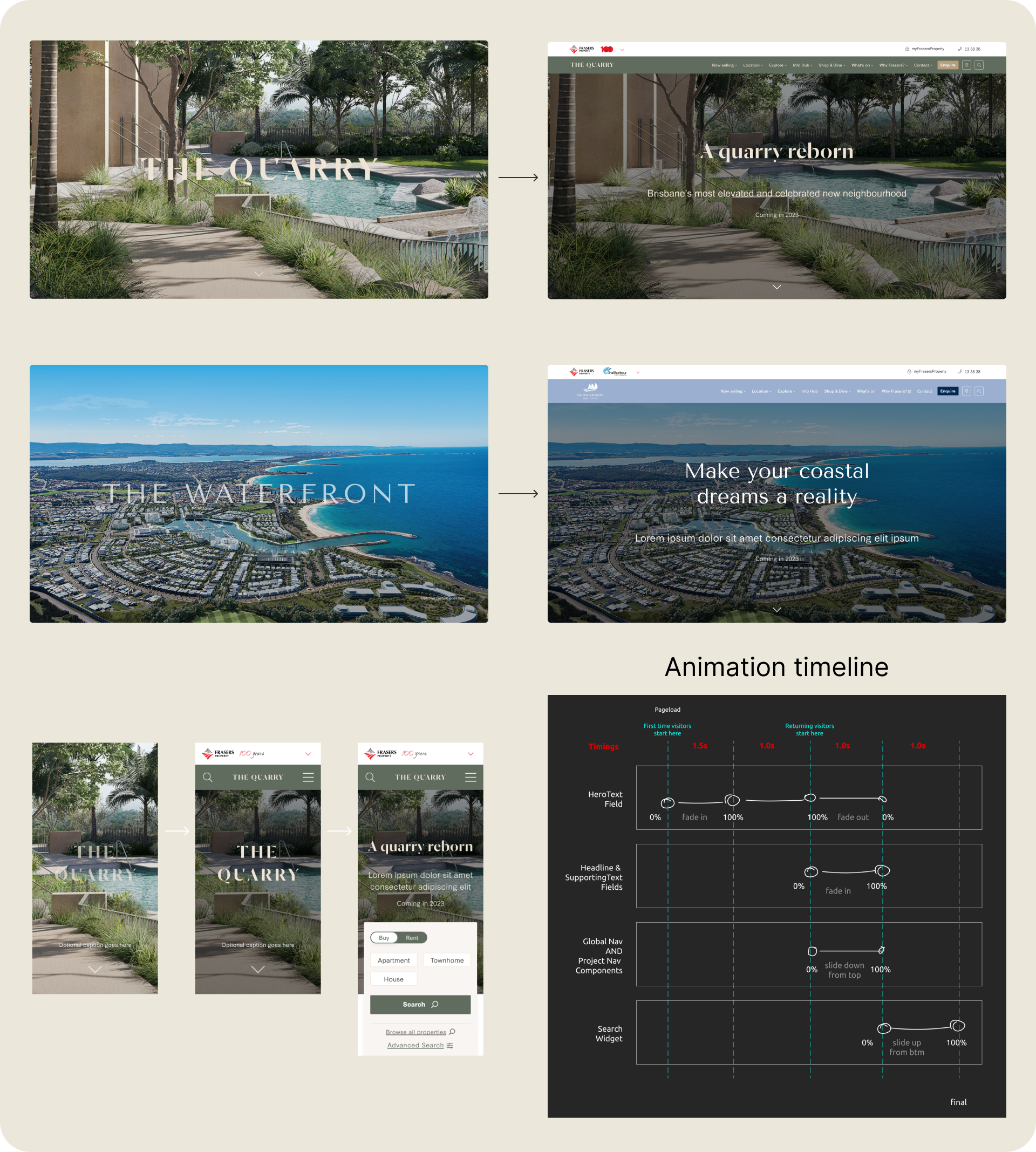
To create a best-in-class, visually impactful experience showcasing the breadth and quality of Frasers Property Australia’s residential projects, I applied Parallax effects to the key components on the Homepage. These included a Video splash opening screen, Bird eye view video, Property highlights with horizontal scrolling and a few animated components, including Animated hero text and Animated zoom-out image & text components.
Impact
The incorporation of the Parallax effects has significantly enhanced the user experience by adding dynamic engagement, visual appeal and smoother navigation. These effects captivate users' attention, providing an immersive browsing experience that encourages exploration and boosts engagement.
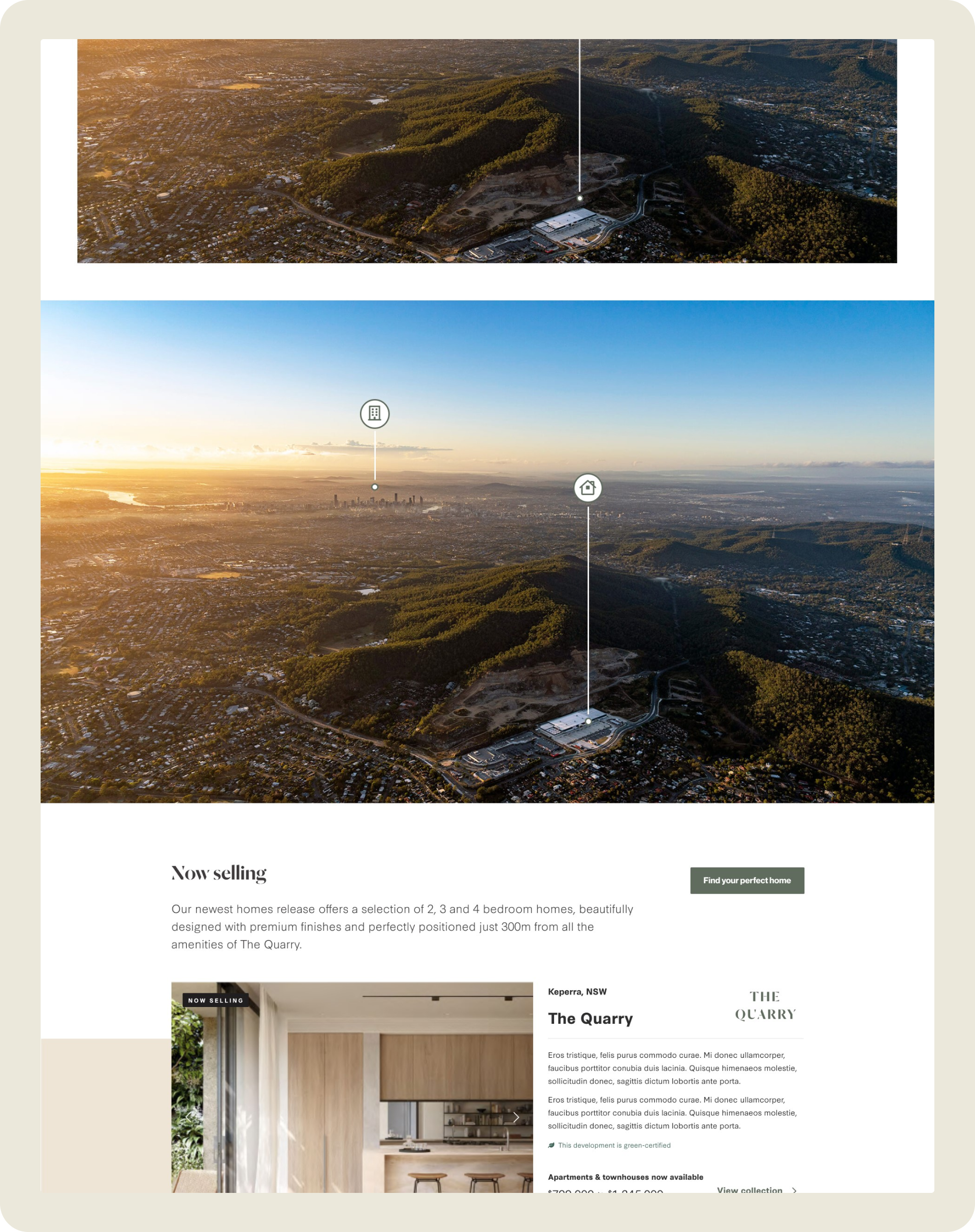
With Parallax horizontal scrolling used for the Property highlights component, we guided users through the featured properties showcasing a wide rage of properties types, grouped by collections and releases, while also displaying construction status. These features support one of the project objectives: educate and inform users about different property types and development lifecycles.
By animating hero text and key images, we achieved a seamless transition between sections and created more intuitive, engaging and memorable user interface.


2. Advanced search widget
To provide users with comprehensive property search functionality, allowing them to search across various property types and releases, we introduced an advanced search widget and modal, featuring dynamic filters that adjust based on the available property types and user selections. I have created multiple designs to cater to various scenarios, both for desktop and mobile. This feature supports the objective of creating a tailored customer experience, making the search process intuitive and easy.

3. Primary navigation and Mega menu
Following extensive competitor and user research, I proposed a new Information Architecture (IA) and naming conventions for new residential websites, which are reflected in the new Project Header and Mega menu. The new IA and terminology have been standardised across all project sites to ensure consistent user experience. I designed multiple variations to accommodate various residential logo layouts and use cases as well as different screen sizes, ensuring responsiveness, flexibility and scalability of these components.

4. Global Header and Footer
To support the objective of seamlessly integrating the Frasers Property Australia’s (FPA) corporate brand into the residentail site designs, I proposed a two-tier main navigation. The top tier is the Global Header, allowing users to easily navigate to the FPA corporate site, contact a call centre and access a customer account for return visitors.
Additionally, the Global Header features the 100 years anniversary logo, further enhancing the corporate brand legacy. For the Footer, I replicated the FPA corporate designs, including the corporate colours, font and brand elements to support the requirement of maintaining 30% corporate brand presence.

5. Components showcasing the key features, benefits and quality of residential projects
To accomplish the objective of showcasing the Frasers Property Australia’s portfolio and supporting sales conversion, I designed several new components specific to residential properties. Each component has a few variations and configurations to account for different use cases, giving the client flexibility to apply them in various scenarios and for different projects.
‘Fast facts’ giving users a quick snapshot of the key details about the development
‘Hotspot Interactive’ - an interactive component giving users an overview of the community amenities or interior options
‘Google Maps with Amenities’ showing users amenities available in the neighbourhood


6. Components showcasing individual property lots
Previously, Frasers presented their properties mainly at the Collection level, not providing many details of individual properties. To showcase the breadth of Frasers Property Australia’s portfolio, educate users on various property types and support sales conversion, I included property detail pages in the new Information Architecture and designed the Lot Detail page template and several new components, highlighting individual property lots. These components include:
Lot Detail Image Gallery
Media Toolbar to provide information in various formats (video, brochure, virtual tour) and allow users to share the page
Key Features
Image Slider for Interior Colours
Masterplan for Land parcels

7. Conversion components
To support the Sales conversion objective and promote new releases, I designed landing pages for the client's marketing campaigns. The implementation of sticky in-page navigation facilitates user navigation and ensures the accessibility of call-to-action (CTA) buttons throughout the browsing experience. These pages are instrumental in boosting traffic, capturing new leads and ultimately driving increased sales conversions.
In addition, to enable users to quickly and easily contact sales agents or book appointments, I designed the ‘Visit Display Centre’ and ‘Contacts & Actions’ components. The ‘Contacts & Actions’ component remains sticky at the bottom of the page, ensuring the contact details are easily accessible at all times.

8. Design System
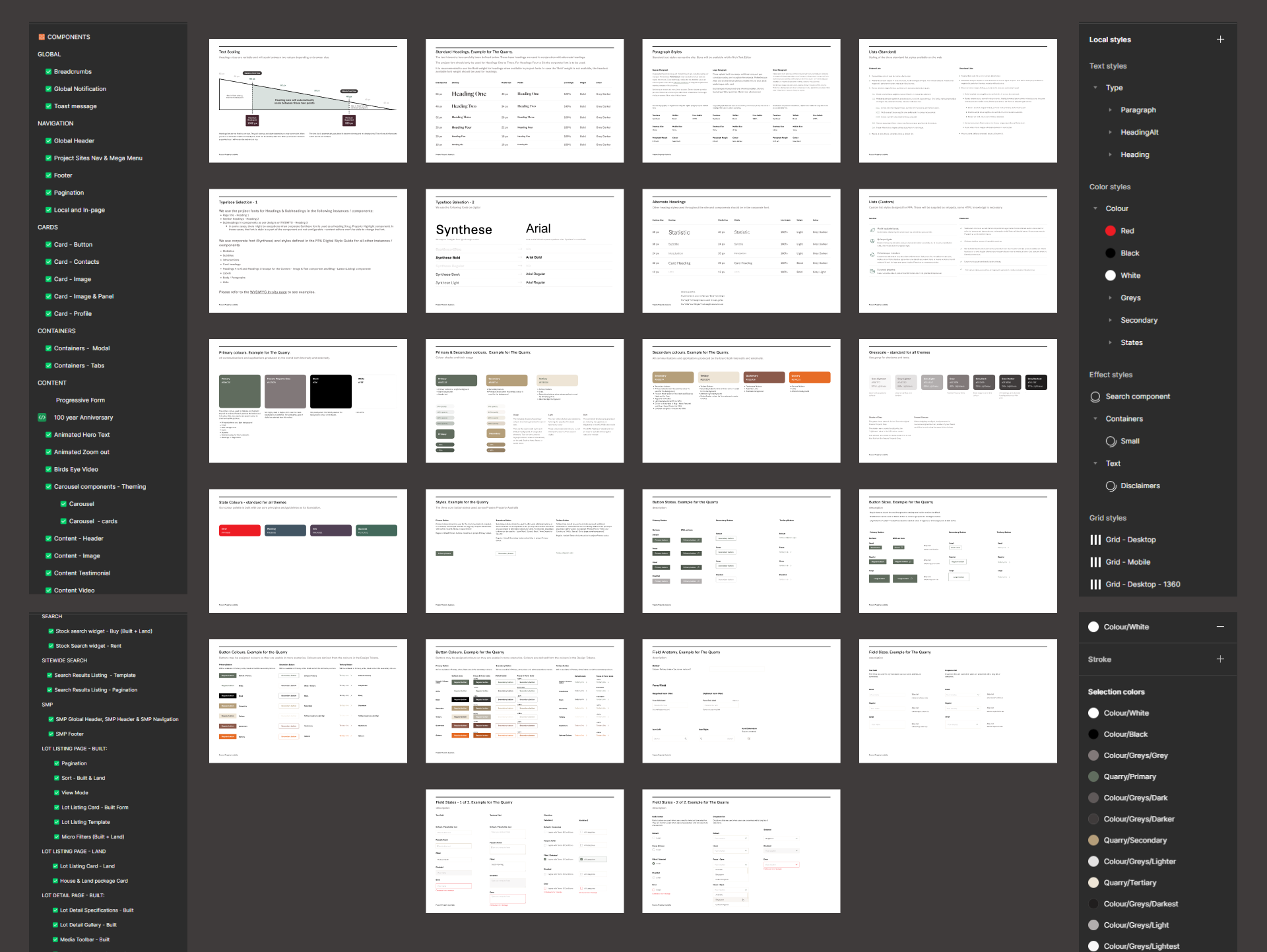
To ensure consistency across all residential sites and scalability of all components and design tokens, our UX Team developed the comprehensive Design System. I personally designed all design tokens, the GUI Kit and pattern/component library. Additionally, I defined the principles and guidelines outlining how these assets should be used when implementing them across all other residential sites. The primary designs were executed for one residential project and stress-tested on another project.
As a result, the introduction of the Design System has allowed for the seamless scaling of all components and assets, facilitating the rollout of designs across 15 residential sites within a short timeframe. This has significantly improved the efficiency of the design and development teams and enhanced consistency across multiple residential websites.
Design process
-
![]()
Discovery
During the Discovery phase, I:
Analysed user research findings provided by the client.
Conducted competitor research on 30 residential property websites.
Performed a gap analysis of available Persona data.
Facilitated Use Case Mapping and Customer Journey Mapping workshops.
Created a Customer Journey Map outlining key tasks, touchpoints, pain points, and opportunities.
Developed a tailored Information Architecture (IA) for Apartments & Townhomes and Land lots.
-
![]()
Wireframing & Prototyping
During this phase, I created 10 mid- to high-fidelity wireframes for the Homepage and section landing pages. These wireframes were developed based on the insights identified from the Discovery activities, aiming to conceptualise and visualise page layouts, structure and functionality. Another goal was to gather early feedback, facilitating rapid iteration and refinement of the designs.
-
![]()
Visual Design
During the visual design phase, I designed and re-themed 80 reusable components and 8 templates, ensuring alignment with the project's brand guidelines, UX heuristics, visual design principles and WCAG 2.2 accessibility requirements. Adopting a component-led approach streamlined our process, enhancing design consistency and scalability.
-
![]()
Design System
As part of this project, I developed a comprehensive Digital System comprising design tokens, a GUI Kit, components, and rules and principles. This system guided the creation of the user interface and facilitated seamless scaling of the designs across multiple residential sites. Key components and templates have undergone stress-testing to ensure compatibility with other project brand guidelines, enabling a seamless and consistent rollout of designs. As a result, 15 residential websites and a few commercial sites have been launched within 4 months based on the produced designs.


Results
As a result, we have successfully launched 15 Frasers Property Australia’s (FPA) residential websites within a 4-month timeframe. The upgraded websites have effectively showcased FPA’s product offering, enhanced corporate brand visibility and recognition, improved accessibility compliance and elevated the overall user experience, resulting in increased user engagement, satisfaction, and conversion rates. We have received overwhelmingly positive feedback from Frasers Property Australia’s stakeholders and users.
When designing for a large product portfolio, always stress-test you designs for various brands to ensure the designs are compatible with multiple project brand guidelines and can be seamlessly scaled.
Emphasise the Primary Persona. While addressing the needs of multiple Personas in a project, it's crucial to cater to each one. However, prioritising the user needs of the Primary Persona ensures that the core audience's requirements are met effectively, resulting in a cohesive user experience and laying a strong foundation for overall user satisfaction and engagement.
Scope of Work is not set in stone and can change as the team progresses through the project. Rain check with a Project Manager, Product Owner or Client’s stakeholders to determine whether the budget and time constraints allow us to include a new feature or configuration before proceeding with the client request (CR).
Key takeaways
Client testimonials

“Nadia conducted workshops, presented well-thought-out concepts and wireframes, and provided detailed designs that perfectly captured our vision. She remained actively involved during the build phase, collaborating with our team to address any minor issues and ensure a seamless implementation. The end result exceeded our expectations, and we are thrilled with how our new websites turned out.”
~ Lisa Reed, Digital Director, Frasers Property Australia
More projects

Frasers Property Australia Corporate website redesign & rebuild
UX/UI Design | Design System | User Testing

Tony’s Tyres website redesign
UX/UI Design | Design System

Lube Mobile website redesign
Research | UX/UI Design | Design System